You guys are brilliant. What can I say ? :)
Anyway, so here are the final 6! If you've already voted, feel free to vote again. Now that it's on the photo, you might change your mind. Ya never know!
Due to our extremely busy schedule over the next week, I'm going to leave the voting open until we get finished with all of our shoots and get transitioned from one house to another. So we'll probably decide on our brand new logo by the end of next week (with your help, of course...). Spread the word until then! We would love all the input we can get!
PS. Just so we stay consistent, I've numbered the logos the same as from our last logo post :)
VOTE AWAY!
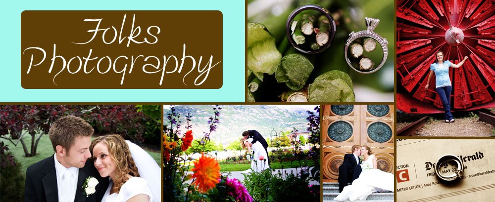
#1:

#3:

#5:

#6:

#8:

#11:


Oh wow, 11 no comparison. Who is the genius that made that masterpiece? Wowzer Mgowzer!
ReplyDeletehaha sally you make me giggle like a little school girl :)
ReplyDeleteI think number 11- guess I like pok-a-dots! But really, they all look nice! I'm sure you'll pick the best one!
ReplyDeleteThank you so much! I kind of LOVE that one too :) I'm 100% a polka dot lover...
ReplyDelete6!!
ReplyDeleteThanks so much Gena!!!!
ReplyDeletecan I vote for 3??? maybe that isn't helpful but I like them all the same! #1, 8, & 11! great photos! love your work!
ReplyDeletehaha heck YES you can vote for #3!!!! Thanks so much Savvy :) you rock my world!
ReplyDeletei actually liked #2 :(
ReplyDeleteanyway.... #1 i like - but it seems pretty close to your old logo and "theme"
#6 is different and so i like it. well, maybe it's not crazy unique, but it's cool. i just like the simplicity. i've thought about doing something like that before.
#11 is super fun! and unique. so if you're going for big changes that'd be it for me! but if it doesn't "go" with your style of photography then i wouldn't do it. but i think it works. so yeah.
#6, in second place #11. in first place #2 lol
haha awwww you didn't tell me you liked #2 in the first post, so i just tallied up all the votes for the top 6 and went from there haha but I actually really love 6 too-- it's really simple and professional looking. I just can't decide how big of a change i'm going for haha that's why i needed you haha thanks so much for your input tho!!!!
ReplyDelete#1 is still my favorite!
ReplyDelete#11 is my favorite!!!! I LOVE POLKA DOTS!!
ReplyDeleteawesome!!!! thanks guys ;)
ReplyDeleteStill like #11. It's unique and I think it sort of represents your personality. Bubbly!!!! :)
ReplyDeleteI love number 6. So simple and classy.
ReplyDeletenow that it is on a picture, i think #1 is the best.
ReplyDeleteI vote #1. Good luck!
ReplyDelete